Select works
Select works

SHOTPRO
SHOTPRO entered the next chapter in their business, so they approached me to design a new visual identity and a high-end website to match. They needed something that felt at home in corporate spaces without feeling disconnected from culture. - view website.
[ brand + website ]

SHOTPRO
SHOTPRO entered the next chapter in their business, so they approached me to design a new visual identity and a high-end website to match. They needed something that felt at home in corporate spaces without feeling disconnected from culture. - view website.
[ brand + website ]
SHOTPRO
SHOTPRO entered the next chapter in their business, so they approached me to design a new visual identity and a high-end website to match. They needed something that felt at home in corporate spaces without feeling disconnected from culture. - view website.
[ brand + website ]

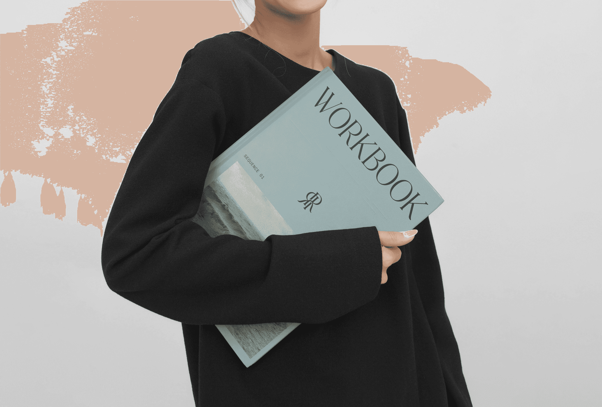
Rose Riebl Piano Studio
Rose imagined this brand to feel like her music; elegant and grounded. We pulled references from high fashion labels, and balanced the edginess with nature and soft colour palette - view website.
[ brand + website + Social ]
Rose Riebl Piano Studio
Rose imagined this brand to feel like her music; elegant and grounded. We pulled references from high fashion labels, and balanced the edginess with nature and soft colour palette - view website.
[ brand + website + Social ]
Rose Riebl Piano Studio
Rose imagined this brand to feel like her music; elegant and grounded. We pulled references from high fashion labels, and balanced the edginess with nature and soft colour palette - view website.
[ brand + website + Social ]

Journey
Journey’s brand is minimal yet intentional, as you can see with their packaging and marketing billboards. As an add-on, we also created a bank of social templates and a social media guide to keep everything cohesive.
[ brand + website + social ]

Journey
Journey’s brand is minimal yet intentional, as you can see with their packaging and marketing billboards. As an add-on, we also created a bank of social templates and a social media guide to keep everything cohesive.
[ brand + website + social ]

Kornati Swimwear
Brittney and I have been creating custom textile prints together since 2019. Kornati is dedicated to donating profits to wildlife conservation and cancer research, which aside from our creative alignment, is another reason for our ongoing collaborations. The Save the Bees bikini sold out twice, and we have a new collection coming out this summer.
[ Textile design + Packaging ]

Symposia
Symposia is a cybersecurity intelligence platform offering hands-on education and trust services. The team was looking for a way to symbolise welcoming all walks of life, which led to the scrapbook concept. The griffin logo represents growth and prosperity, while the North Star serves as a compass.
[ brand + website ]

Future Flow Plumbing
We skipped the clichés and had some fun instead. The logo and icons are hand-drawn to lean into the brand's retro aesthetic. Each touchpoint was made to feel youthful and approachable without losing professionalism and trust.
[ brand + website + Social ]

Future Flow Plumbing
We skipped the clichés and had some fun instead. The logo and icons are hand-drawn to lean into the brand's retro aesthetic. Each touchpoint was made to feel youthful and approachable without losing professionalism and trust.
[ brand + website + Social ]
Future Flow Plumbing
We skipped the clichés and had some fun instead. The logo and icons are hand-drawn to lean into the brand's retro aesthetic. Each touchpoint was made to feel youthful and approachable without losing professionalism and trust.
[ brand + website + Social ]

ServiceSurfer
Finn wanted a premium, minimal look with one key colour and an approachable feel. The logo combines a positive inclined arrow, a cursor shape, and a subtle rocket to symbolise ambition and scalability.
[ brand + website ]

ServiceSurfer
Finn wanted a premium, minimal look with one key colour and an approachable feel. The logo combines a positive inclined arrow, a cursor shape, and a subtle rocket to symbolise ambition and scalability.
[ brand + website ]
ServiceSurfer
Finn wanted a premium, minimal look with one key colour and an approachable feel. The logo combines a positive inclined arrow, a cursor shape, and a subtle rocket to symbolise ambition and scalability.
[ brand + website ]

The Cat Conundrum
Emer’s brief was simple: a title card with elegance, movement, and a little mischief. The typography is hand-drawn with curves that curl like a cat's tail. The film picked up Best Melbourne Short Documentary in 2024.
[ Custom font ]

The Cat Conundrum
Emer’s brief was simple: a title card with elegance, movement, and a little mischief. The typography is hand-drawn with curves that curl like a cat's tail. The film picked up Best Melbourne Short Documentary in 2024.
[ Custom font ]
The Cat Conundrum
Emer’s brief was simple: a title card with elegance, movement, and a little mischief. The typography is hand-drawn with curves that curl like a cat's tail. The film picked up Best Melbourne Short Documentary in 2024.
[ Custom font ]

Autumn Files
Hudson was looking for a title card that felt nostalgic. The letters are hand-drawn, working with soft inconsistencies that added to the overall charm.
[ Custom font ]

Autumn Files
Hudson was looking for a title card that felt nostalgic. The letters are hand-drawn, working with soft inconsistencies that added to the overall charm.
[ Custom font ]
Autumn Files
Hudson was looking for a title card that felt nostalgic. The letters are hand-drawn, working with soft inconsistencies that added to the overall charm.
[ Custom font ]
Feel like we align?
Feel like we align?
Feel like we align?
I respect and honour the Wurundjeri people of the Kulin Nation and Torres Strait Islanders Elders past, present and future. I acknowledge the stories, traditions and living cultures of this land and commit to building a brighter future together.
Always was, always will be.

Website designed & developed by Hannah Jayde
© 2025 Hannah Jayde | All Rights Reserved
I respect and honour the Wurundjeri people of the Kulin Nation and Torres Strait Islanders Elders past, present and future. I acknowledge the stories, traditions and living cultures of this land and commit to building a brighter future together.
Always was, always will be.
Website designed & developed by Hannah Jayde
© 2025 Hannah Jayde | All Rights Reserved